Every year, our astronomy department has a summer barbecue. It's one of the largest events we have since almost everyone is there and brings their families. The most recent one was in June 2016 (I know, practically last week! I'm still catching up on the posts) and I wanted to make something different.
I was looking through some french macaron templates (sheets of 8.5 by 11 inch paper that you place under parchment paper to guide how large each macaron is) and I noticed the 2.5-inch circle template. Typical macrons are 1.5 inches in diameter, so the 2.5-inch template caught my attention and made me wonder what reason I could have to make macarons so large. So, I thought of a reason: stars!
Stars are circular and the come in a range of sizes. Well, actually they're spherical, but when they are projected on the sky, they look circular, but that's a technical detail. Stars also range in sizes that are not scaled down very well to 1 to 2.5-inch macarons...at least not in linear space. So after some internal debating, I figured that this star-macaron analogy would work so long as I accepted the fact the macarons would be to scale if I plot--err, I mean bake them logarithmically. As in, the 2.0-inch macarons are 100 times larger than the 1.0-inch macarons in logarithmic scales. Yes, these are the details I worry about when I'm baking something related to astronomy.
You can take things one step further if you add color to the macarons, use this color as a proxy for temperature, and the let the sizes of the macarons represent luminosity. Now we have all the ingredients for an HR diagram. The HR is short for Hertzsrpung and Russell, who were two astronomers who devised a way to show how stars change relating their temperature and luminosity. An HR diagram looks something like this:

This is a color-magnitude diagram I made for Science Buddies a couple years ago. It is essentially the same as an HR diagram where each point is a star and as a population, we can see the star's luminosity (G magnitude here) change with its temperature (color here).The European Southern Observatory has a prettier version of this.
With my idea finally in place, I got to work creating an HR diagram of french macarons:

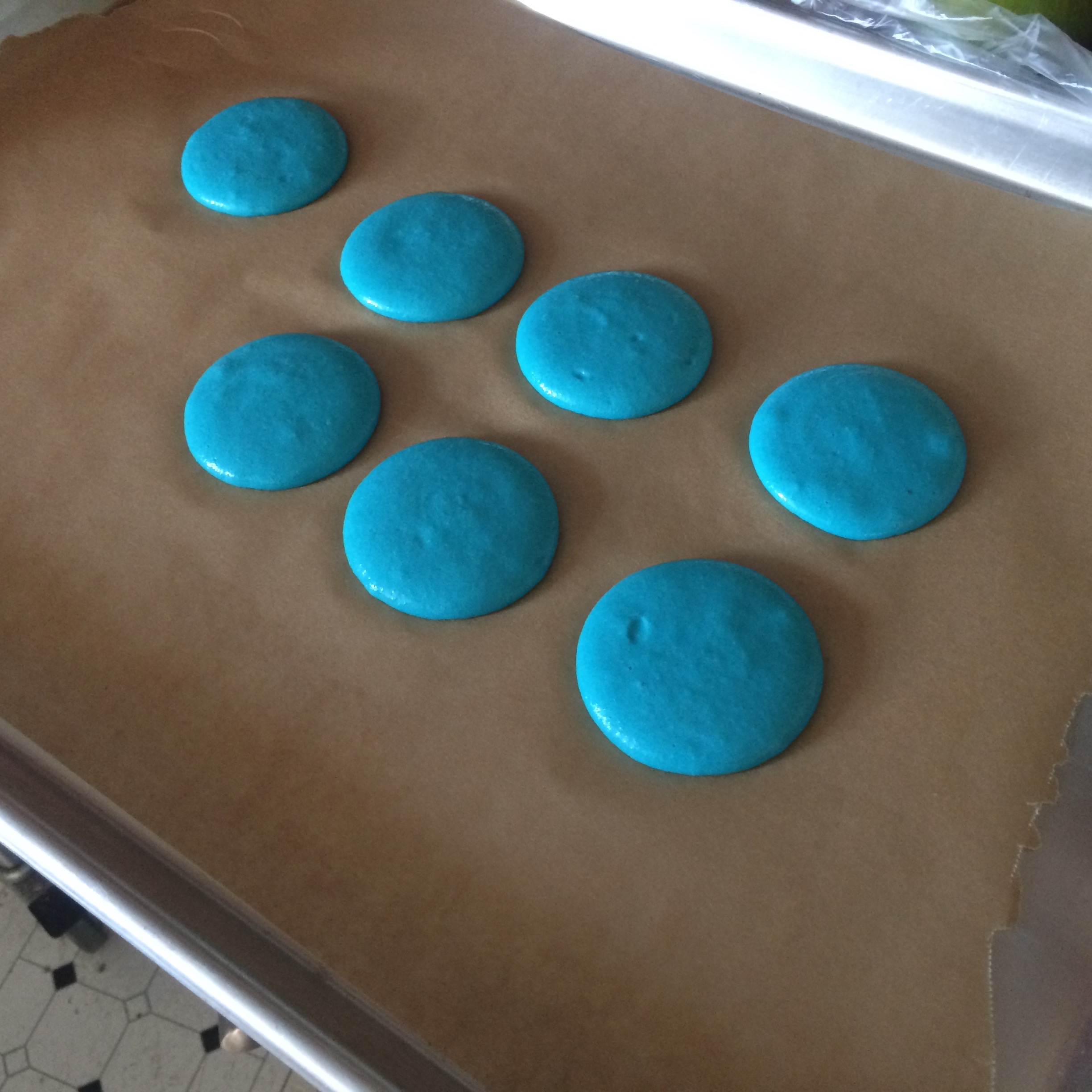
These are aged egg whites whipped into a meringue and dyed red with gel based food dye.
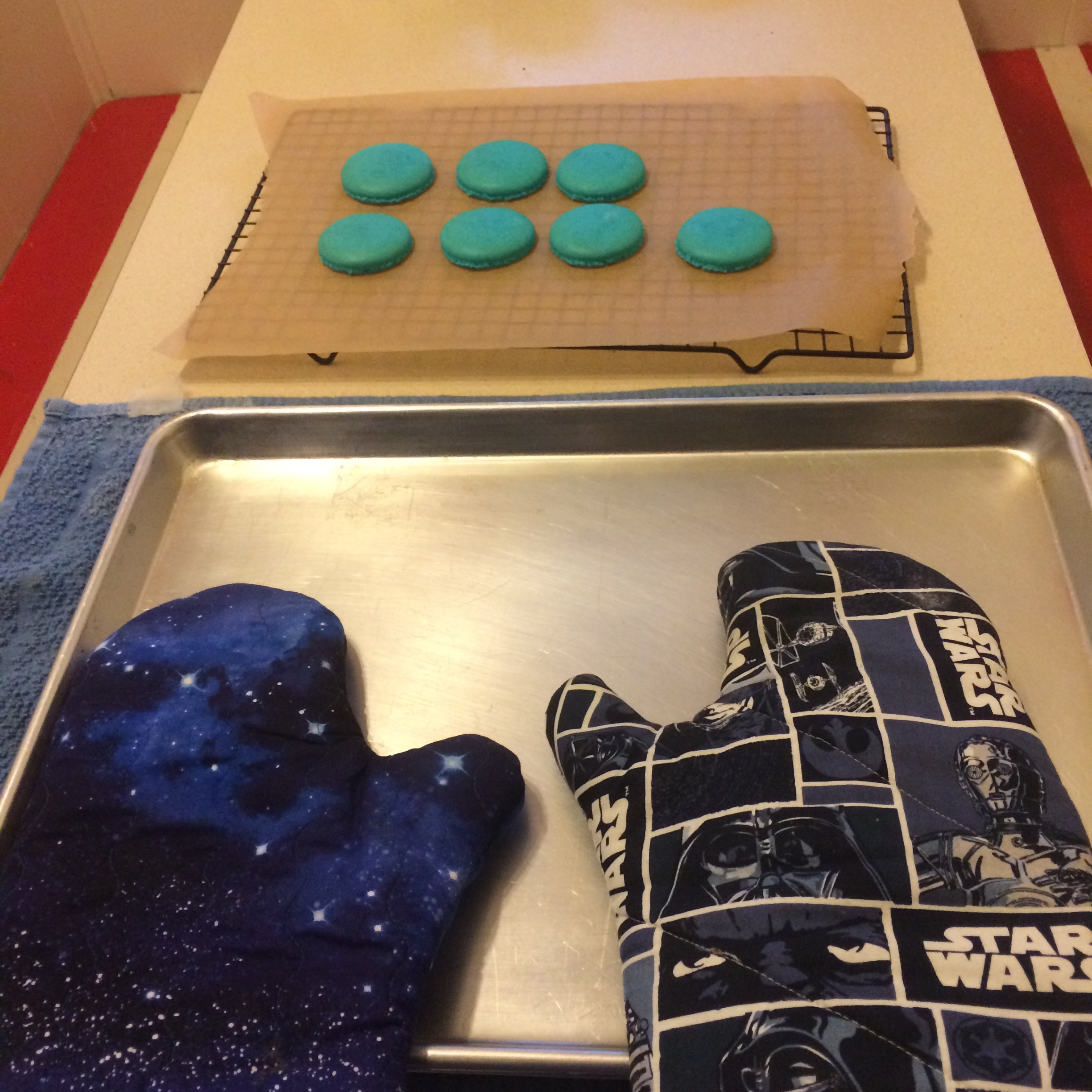
The red macarons became M-dwarf and red giant stars. I also made blue, yellow, and orange macarons to represent other kinds of stars from those like the Sun to blue sub-giant stars.

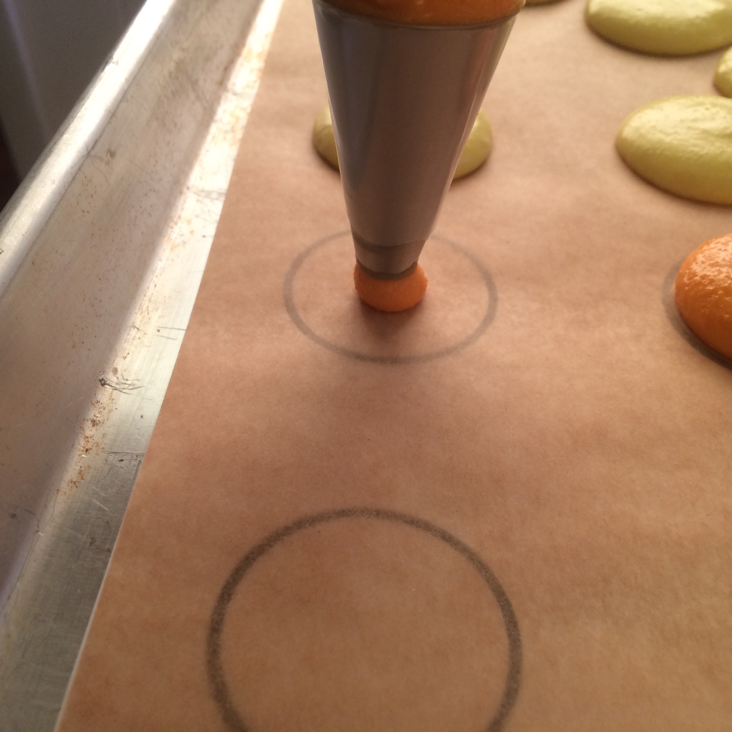
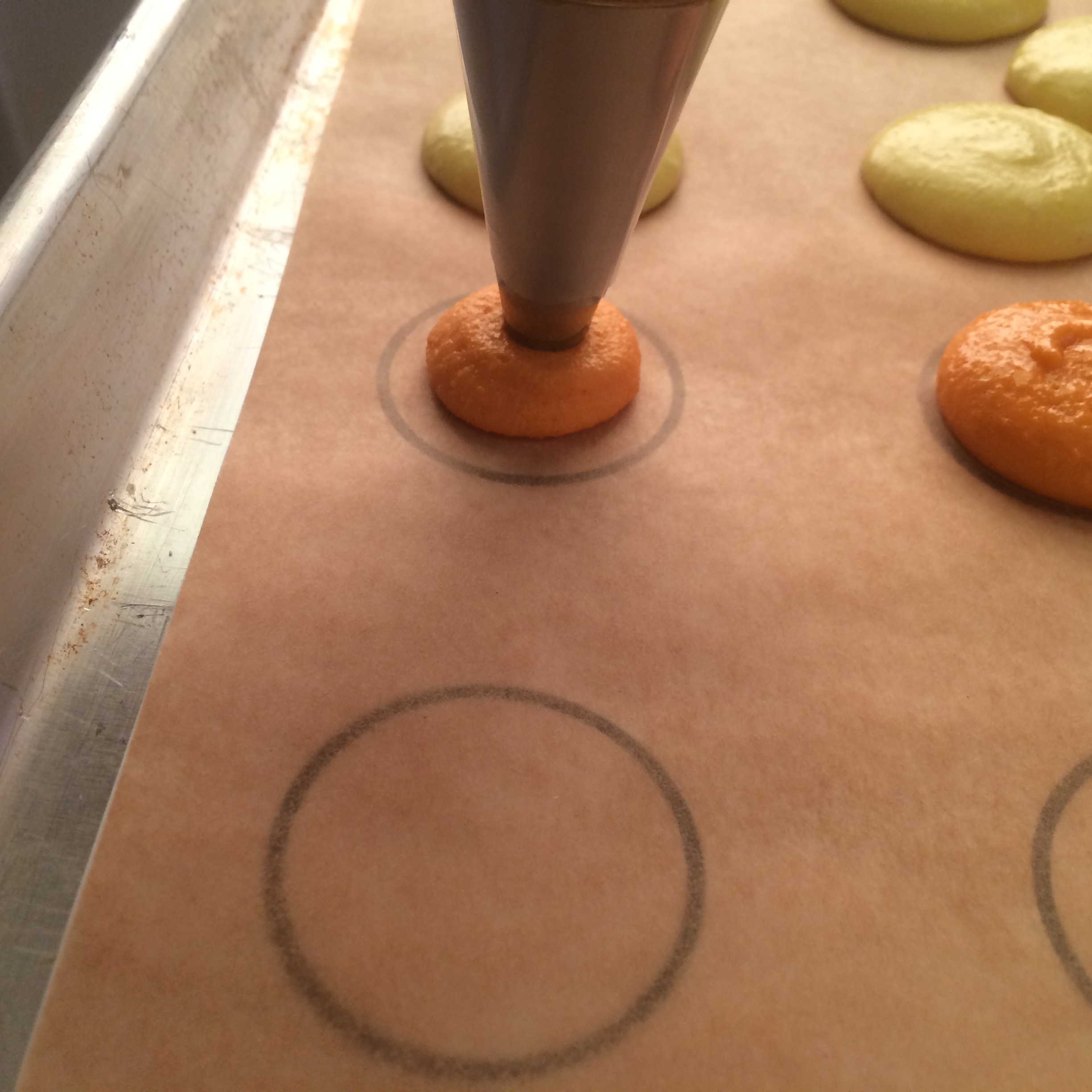
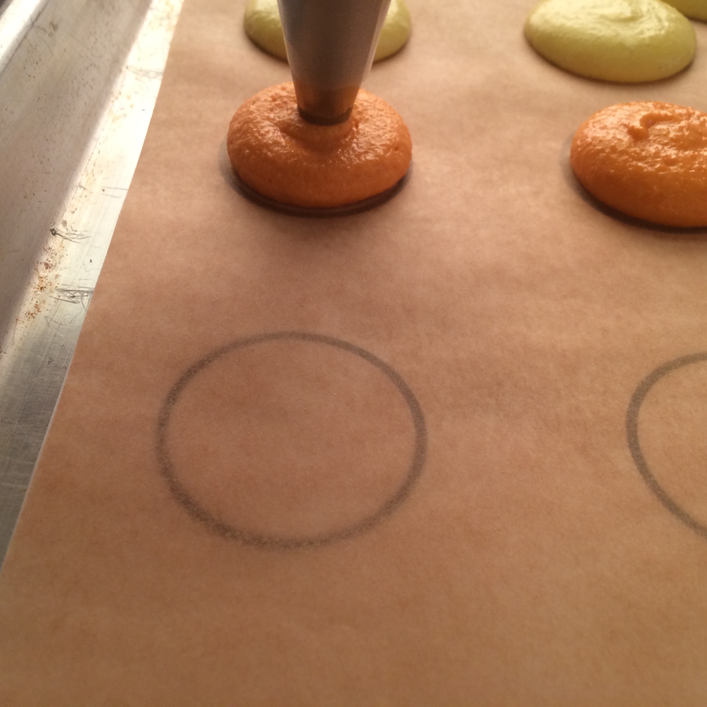
These are some "action shots" of me piping the macarons onto parchment paper. Piping bag in one hand, camera in the other. I felt really cool doing this. You can see the 1.5-inch template through the parchment paper.

and here's the finished product:

I filled all of the macarons with a vanilla buttercream and colored the buttercream accordingly. The OBAFGKM at the top is yet another (I think we've covered 3 so far) way astronomers classify stars besides color and temperature. Here's how the final display looked at the BBQ.

I left these at the food table and got in line and by the time I got to the table, they were all gone, so I think people appreciated them.
:^)